
The client for this project was Roberto’s Corner, a local sandwich shop. I redesigned their logo, website, and created a new brand for them, as well as created some small animations for them. The programs used for this project were; figma, photoshop, illustrator, webflow, and aftereffects.
THE CHALLENGE
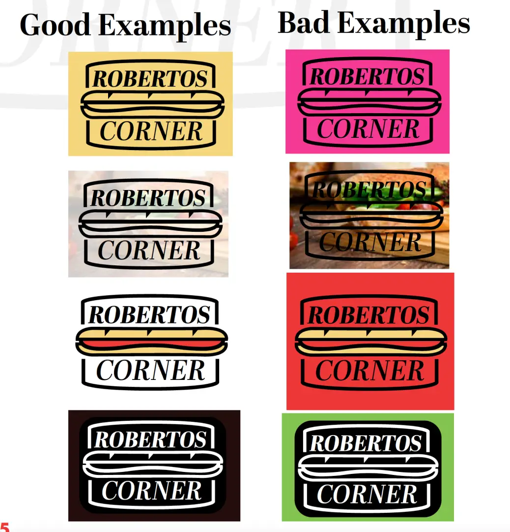
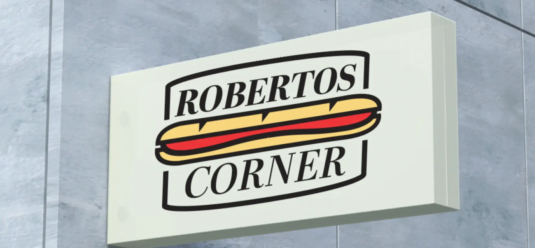
The requirements for this project was to keep the dimensions of their existing signage and advertising space, as well as keeping to the same general color scheme as their shop space has their old brand colors all over and built into the store. the key goals were to rebrand them under those requirements and deliver a new website for them.
THE PROCESS
THE SOLUTION
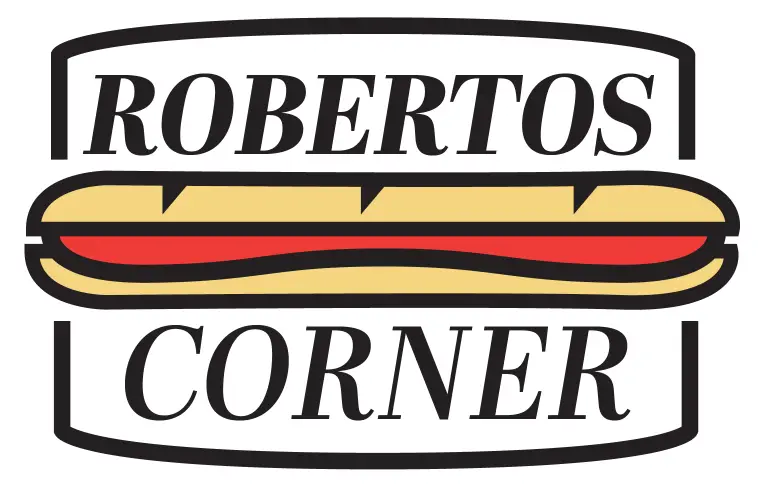
The final new logo shows the new direction of Roberto’s Corner, a bold but classic redesign within the constraints of their existing branding. Using the same colors as the original is a bit of a limitation but with the added tan and the strong black outlines the new logo sets us apart from the old. Using a serifed font is a conscious choice to give Roberto’s a modern edge, as serifless fonts are slowly going out of style. However using a classic serifed typeface keeps the logo timeless.
THE OUTCOME
The skills that i strengthened were definitely my illustrator and webflow skills. I was not too familiar with webflow going into this project and had alot of difficulties with web design but using a content management system for the sandwiches and the menu was super fun and a good way for me to explore webflow. I learnt alot about my design voice in this project. During ideation I was trying to think of a new step forward and to design a perfect new and unique logo and branding for them, but taking a few steps back the correct decision is sometimes to reduce, create something simple and eye catching and to build around that.