
The client for this project was Broadhead Brewing Company, a local Ottawa brewery. This project for them included two beer can designs, a motion piece to go along with them and some advertisements for the new beers. The programs used were Illustrator, InDesign and AfterEffects.
THE CHALLENGE
The design prompt for the two new cans was simply “Ottawa themed and must be a pair”, A very large design space. The goals for this project were to create the two cans and create some advertisements (both print and web) for them.
THE PROCESS
A lot of research was done into these cans. I started by looking into broadheads history and landed on doing notable engineering projects in Ottawa, the owners of broadhead are both engineers so i figured i would go for something in their wheelhouse. Most of their cans also have a very industrial design so these two new cans would be right at home. Looking into engineering projects in Ottawa is also a very interesting history. Ottawa was the home of the greatest engineering minds in Canada from the 60’s to the early 2000’s thanks to Nortel and BNR. I finally landed on the Bell Laboratories building and the Alexandria bridge.
THE SOLUTION
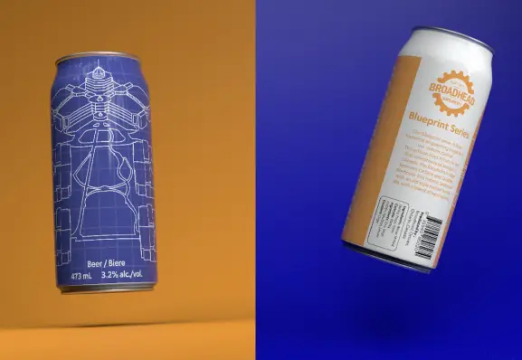
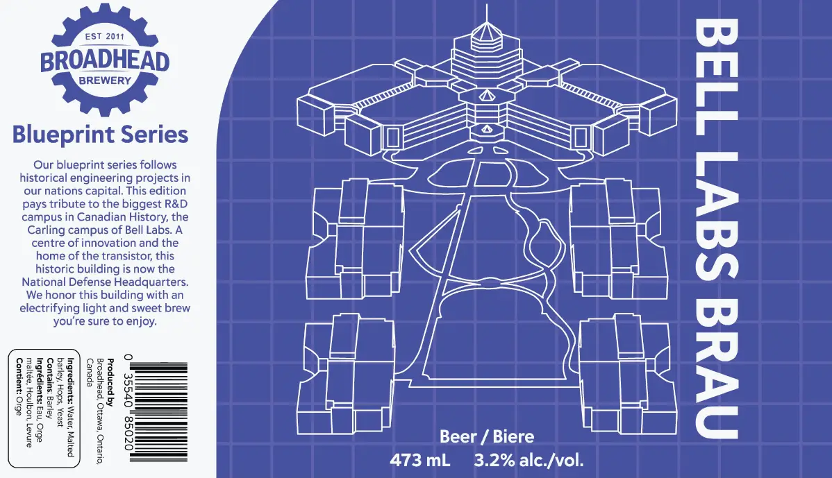
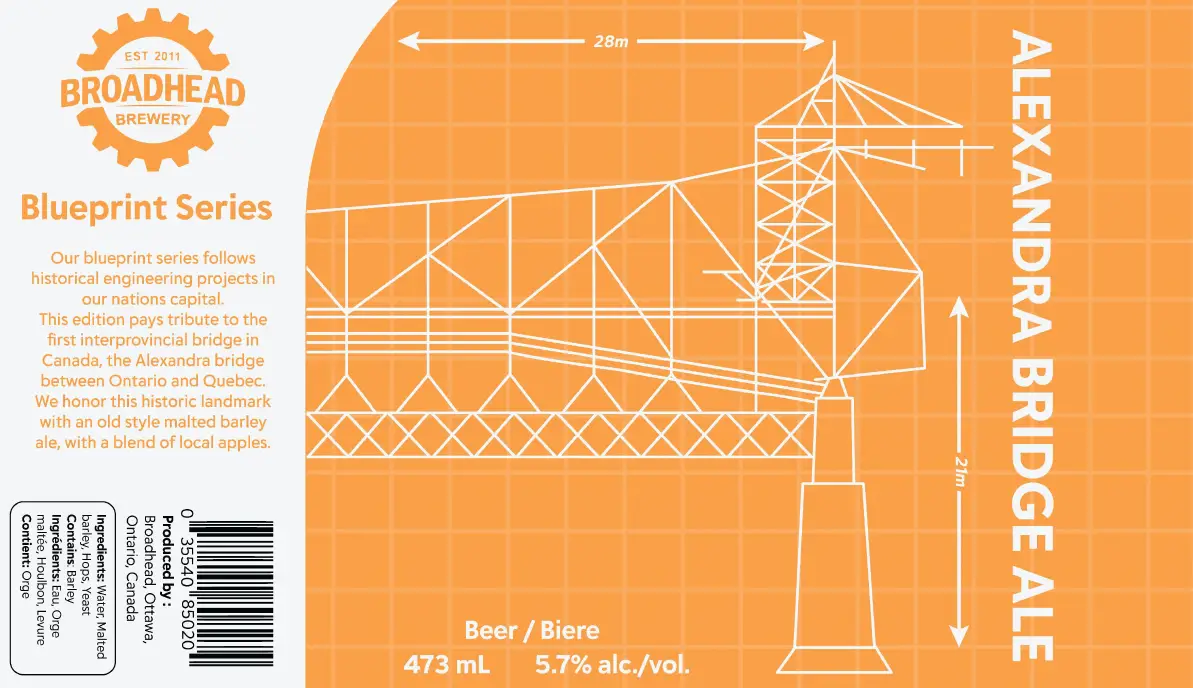
The final can designs are blueprint-esqe designs of the Bell Laboratories building and the Alexandria Bridge. The Bell Labs building was one of the most diversified and well staffed engineering campuses in the world during the 80’s and 90’s. Thousands of engineers and their families moved from across Canada to work here for Nortel. It was such a well funded and well taken care of campus that the Globe and Mail described it as “Corporate Disneyland” unfortunately when Nortel went out of business and was sold out to different entities the Canadian government bought the Bell Labs campus and converted it into a national defence research building and still stands as the most beautiful office building in Ottawa. Our second can depicts blueprints of the Alexandria bridge; the first intraprovincial bridge in Canada. Using blueprint designs and having a unified feel for the cans really solidifies them as a pair, and leaves space for additional beers to be added to this series of cans.
THE OUTCOME
The outcome of this project was super positive! Both the client and I were very happy with the final designs and advertisements. I strengthened my illustrator skills a lot along the way, creating the cans, creating the advertisements and carrying over my paper illustrations into adobe illustrator. Creating the advertisements was also a big learning experience as I used blender and lightroom for the first time to create 3d mock-ups of the cans and animate them. During the process of sketching the designs for the cans I realized that I was more of an artsy designer than a technical one. Some people love to get down into the minute details of type and I realized that i love to just create bold designs with focus on illustrations.